Intro to ggplot2
‘ggplot2’ is a popular graphing package for the R programming language. Once you’ve learned the logic and the general grammar of “ggplot2” it becomes easy to make publication ready graphs. Unfortunately, the learning curve can be pretty steep, especially if you are used to using basic R plots. This is a tutorial to help you get started making graphs in ‘ggplot2’ and help get through some of the learning curve.
Getting ready
First, let’s install the required packages for this tutorial. We will need to install ggplot2 and the palmerpenguins packages. The ‘palmerpenguins’ package has a great dataset we will be using for this tutorial.
install.packages("ggplot2")
install.packages("palmerpenguins")
Next we need to load up the packages.
library(ggplot2)
library(palmerpenguins)
Loading up and checking the data
Unlike plotting with base R. ggplot2 requires data frames to make graphs. For this tutorial we will use the penguin dataset from the package ‘palmerpenguins.’
Let’s get some info about the data set, using str function which tells us each column, type of data and starts printing out columns.
str(penguins)## tibble [333 × 8] (S3: tbl_df/tbl/data.frame)
## $ species : Factor w/ 3 levels "Adelie","Chinstrap",..: 1 1 1 1 1 1 1 1 1 1 ...
## $ island : Factor w/ 3 levels "Biscoe","Dream",..: 3 3 3 3 3 3 3 3 3 3 ...
## $ bill_length_mm : num [1:333] 39.1 39.5 40.3 36.7 39.3 38.9 39.2 41.1 38.6 34.6 ...
## $ bill_depth_mm : num [1:333] 18.7 17.4 18 19.3 20.6 17.8 19.6 17.6 21.2 21.1 ...
## $ flipper_length_mm: int [1:333] 181 186 195 193 190 181 195 182 191 198 ...
## $ body_mass_g : int [1:333] 3750 3800 3250 3450 3650 3625 4675 3200 3800 4400 ...
## $ sex : Factor w/ 2 levels "female","male": 2 1 1 1 2 1 2 1 2 2 ...
## $ year : int [1:333] 2007 2007 2007 2007 2007 2007 2007 2007 2007 2007 ...Making our first ggplot2 graph
In this section we will make our first ggplot2 graph! For simplicity we will to a scatter plot of bill_length_mm and bill_depth_mm to see the relationship of these two variables.
Initializing ggplot2
The first step of making a plot with ggplot2 is to initialize the plot with the function ggplot(). The first argument of the ggplot() function is the dataframe you are using and the second argument defines how you want to map the columns to various components of the graph (e.g., which column will be the x-axis).
For example to make a scatter plot of bill_length_mm and bill_depth_mm:
ggplot(data=penguins,aes(x=bill_length_mm,y=bill_depth_mm))
But it looks empty! Exactly, that’s because we haven’t actually specified what we want to plot. The ggplot function just gives us the set up, we have to tell R what we want to plot.
Adding geoms (making a scatter plot)
To actually visualize our data using ggplot2, we need to use “geoms”. Geoms are ways to visually represent our data and ggplot2 has many different options. Here is a great resource to see some of the possibilities.
In our case, since we want to make a scatter plot, we just need to add geom_point():
ggplot(data=penguins,aes(x=bill_length_mm,y=bill_depth_mm))+
  geom_point()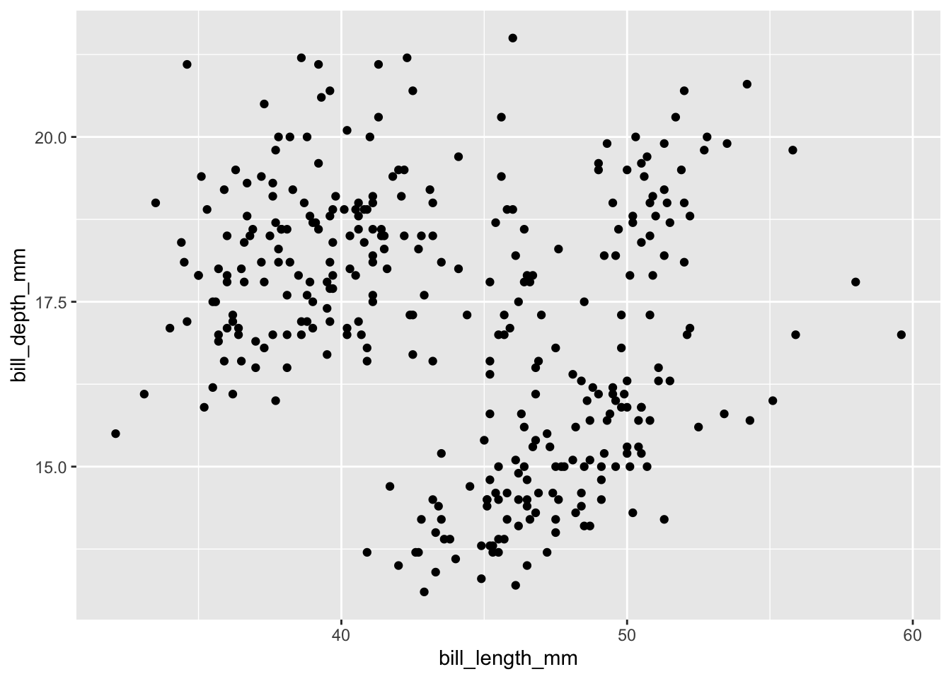
Color aesthetics
It looks like we have three different clusters. Looking back at the data maybe these three different clusters represent the three different species in our data set?
One way we could visualize this is by giving each species a different color, using the color parameter. Since, we are matching some sort of aesthetic to a variable in our data frame it has to go inside aes() like so:
ggplot(data=penguins,aes(x=bill_length_mm,y=bill_depth_mm,color=species))+
  geom_point()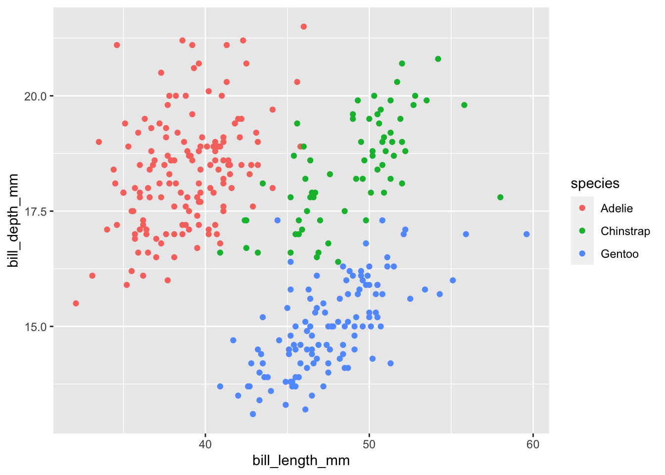
Adding another geom (a line of best fit)
A cool thing with ggplot2 is that it is very easy to add more layers. All we have to do is another + geom_xxx. A logical next step for this scatter plot is to add a line of best fit using the geom_smooth():
ggplot(data=penguins,aes(x=bill_length_mm,y=bill_depth_mm,color=species))+
  geom_point()+
  geom_smooth()
## `geom_smooth()` using method = 'loess' and formula = 'y ~ x'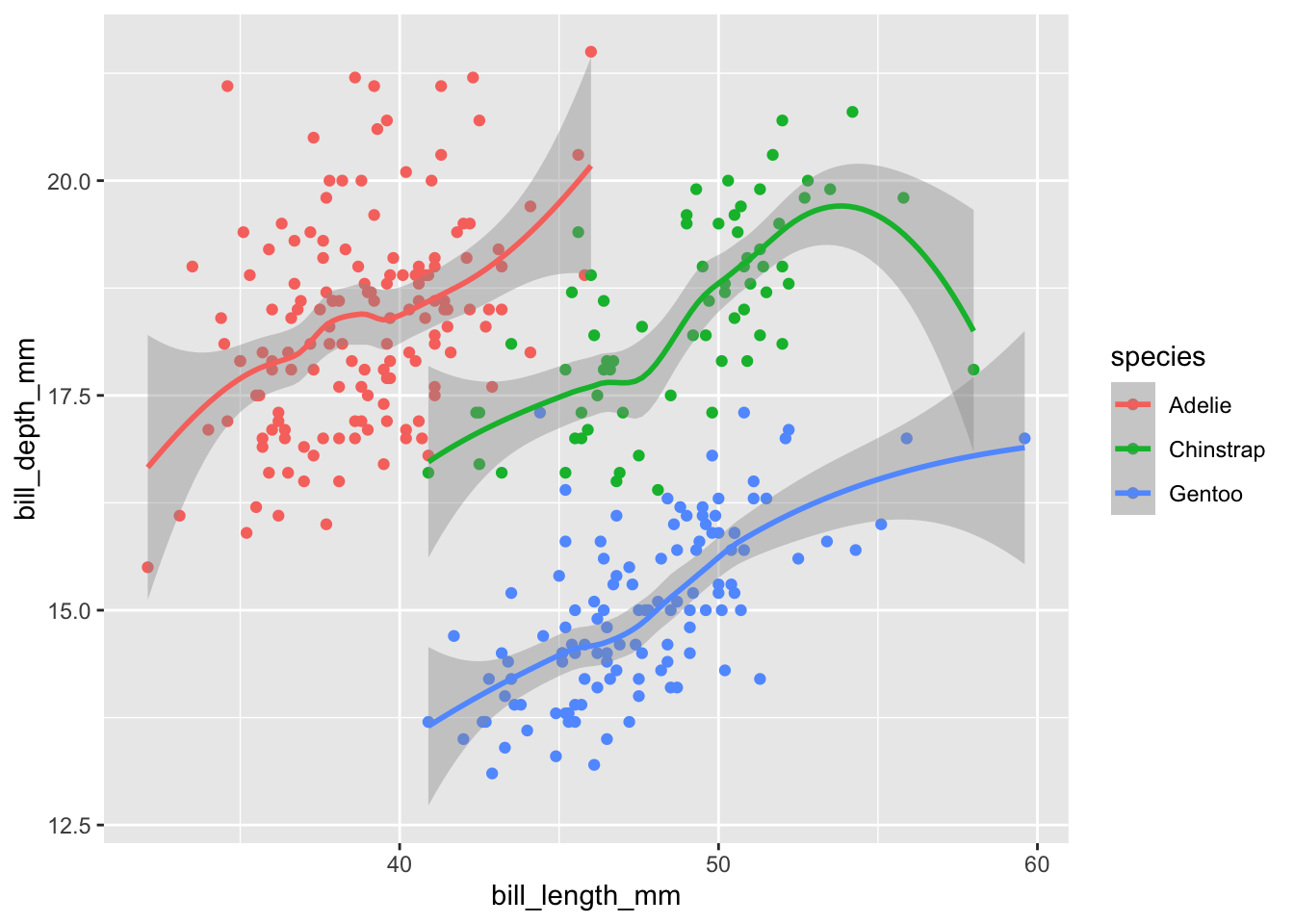
It looks a little weird. That’s because by default geom_smooth uses a “loess” function to fit the data. Essentially this fits seperate polynomial functions between various points of your data and strings them together. Often this is not appropriate and vastly overfits your data. The grey shading, by default, shows the 95% confidence interval of the fit.
We can specify a specific formula for geom_smooth() but this is out of the scope of this tutorial. Instead, let’s just fit a strait line. The way we do this is by passing the argument method="lm" in geom_smooth(). “lm” in this case stands for linear model:
ggplot(data=penguins,aes(x=bill_length_mm,y=bill_depth_mm,color=species))+
  geom_point()+
  geom_smooth(method="lm")
## `geom_smooth()` using formula = 'y ~ x'
A side note on aes()
If you noticed, it fit a separate line and used different colors for the three species. This is because whatever mappings (i.e., whatever is in the aes()) you put within the ggplot() in the first line will be the default for all other layers. However, we can also specify the mappings in individual layers. For example we can the exact same graph with this code:
ggplot(data=penguins)+
  geom_point(aes(x=bill_length_mm,y=bill_depth_mm,color=species))+
  geom_smooth(aes(x=bill_length_mm,y=bill_depth_mm,color=species),method="lm")
## `geom_smooth()` using formula = 'y ~ x'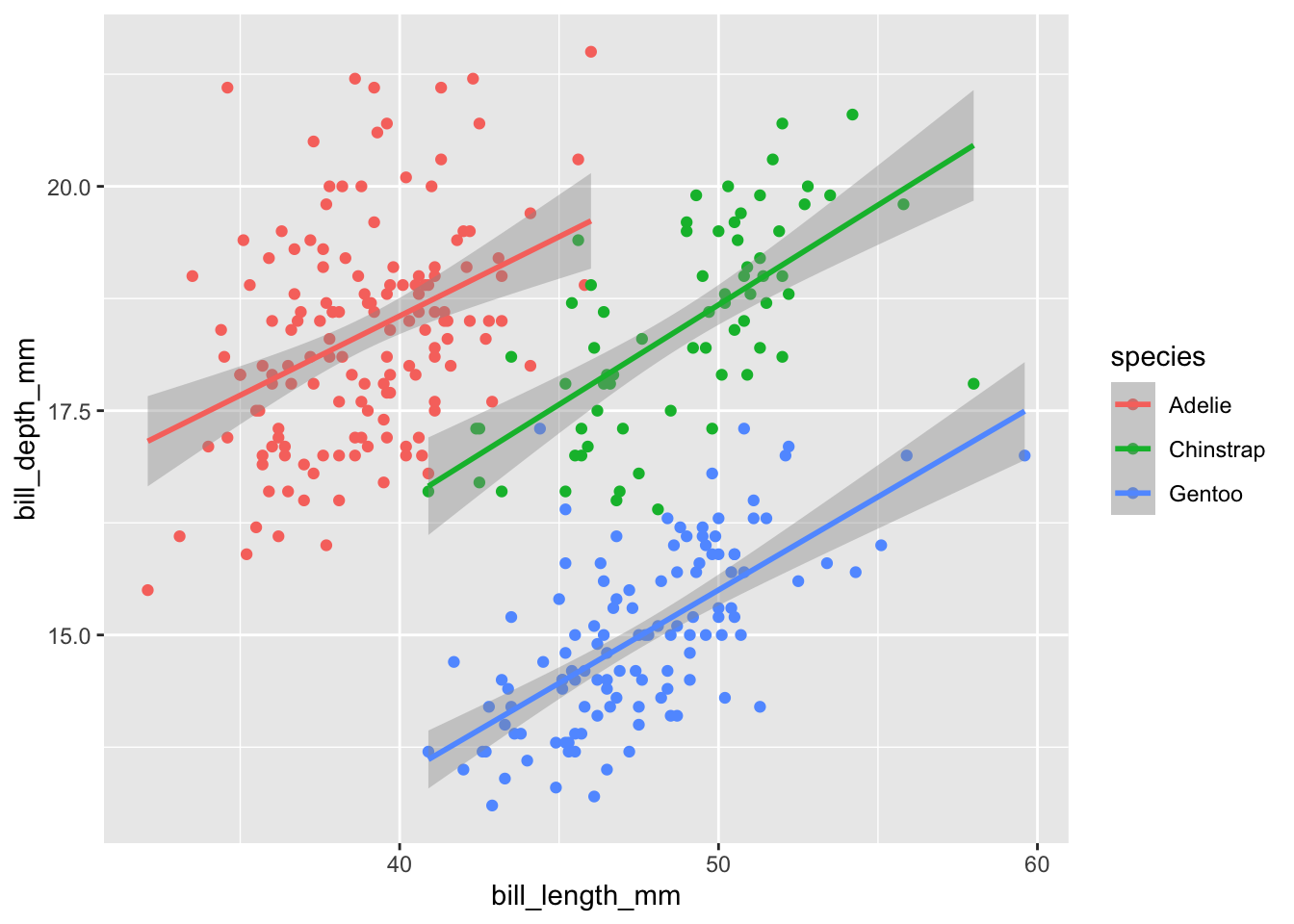
Since we want it to apply to all layers it makes more sense to only type out the mappings once in the ggplot() function. However, if we want different aesthetic mappings to different layers it might make sense to do it this way. For example, say we only want a single line of best fit ignoring the species:
ggplot(data=penguins)+
  geom_point(aes(x=bill_length_mm,y=bill_depth_mm,color=species))+
  geom_smooth(aes(x=bill_length_mm,y=bill_depth_mm),method="lm")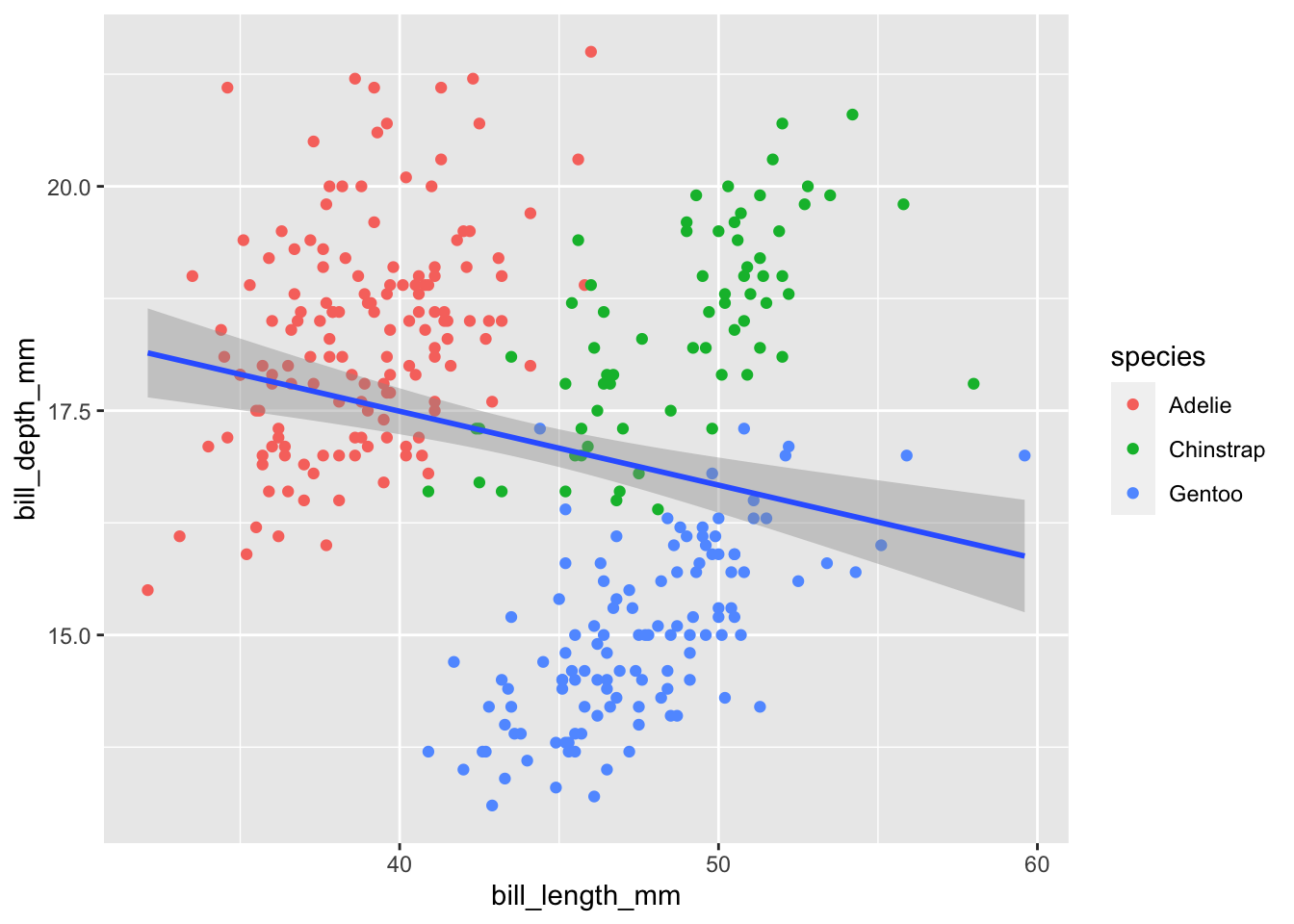
Faceted plots aka subplots
One amazing thing about ggplot2 is that it is incredibly easy to make subplots based on variables in your data. There are two different options: facet_wrap and facet_grid
facet_wrap
facet_wrap is most useful when we only have one categorical variable that we want to make subplots by. Using the same plot as before let’s facet based on island. We either have to do ~varname or vars(varname) in order for ggplot to recognize it as a column name:
ggplot(data=penguins,aes(x=bill_length_mm,y=bill_depth_mm,color=species))+
  geom_point()+
  geom_smooth(method="lm")+
  facet_wrap(~island)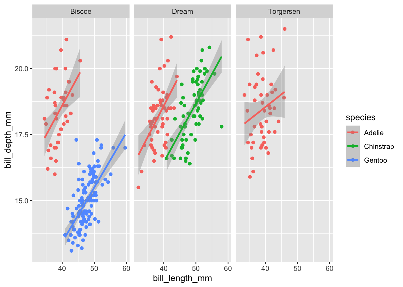
facet_grid
facet_grid is most useful when we have two categorical variable that we want to make subplots by in a grid formation. The way it works is:
facet_grid(horizontal_categorical column ~ vertical_Categorical Column)
Using the same plot as before let’s facet based on island and sex:
ggplot(data=penguins,aes(x=bill_length_mm,y=bill_depth_mm,color=species))+
  geom_point()+
  geom_smooth(method="lm")+
  facet_grid(sex~island)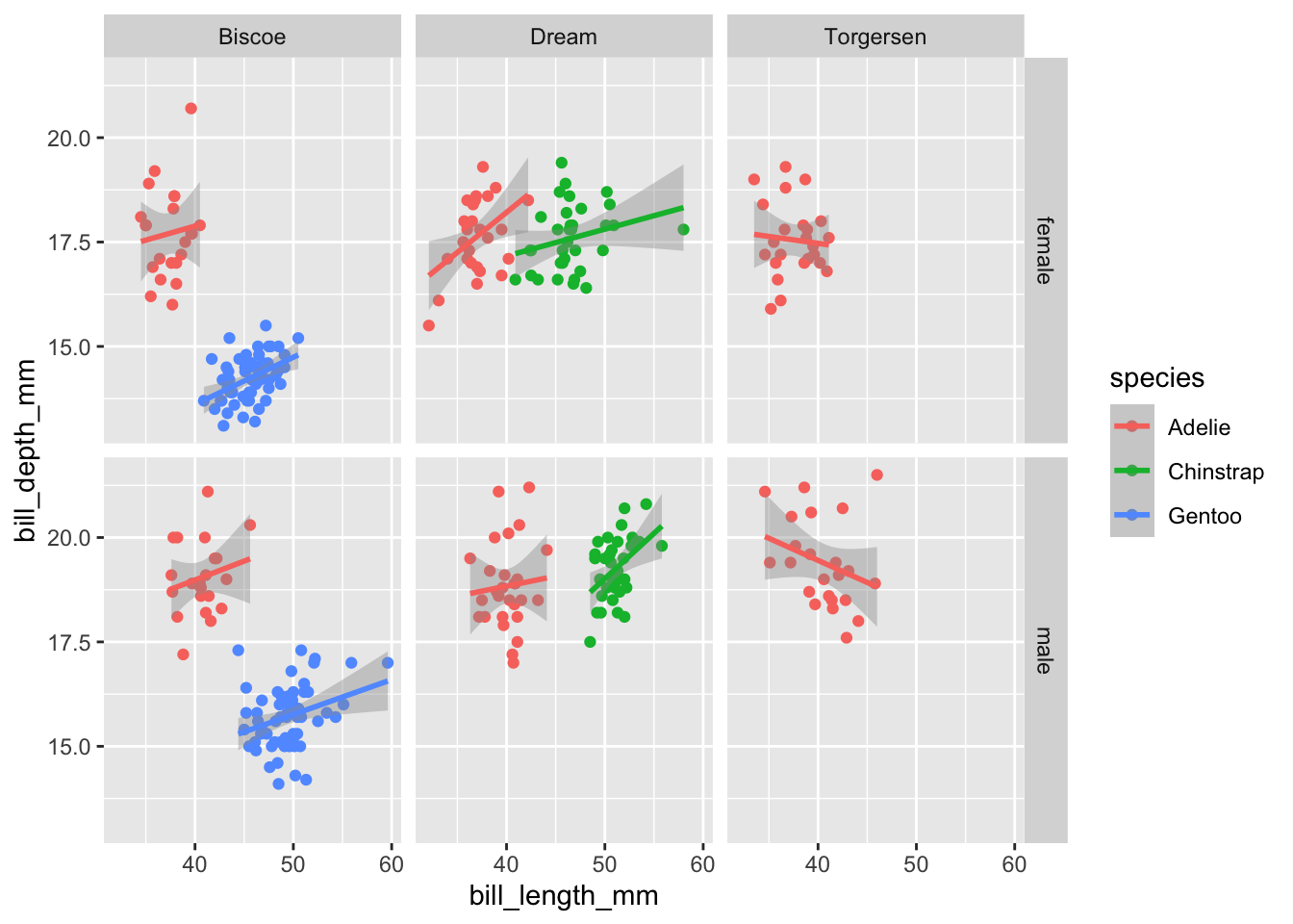
If we wanted to facet by more than two variables, we can combine different combinations with +. This works for both facet_wrap and facet_grid. For example:
ggplot(data=penguins,aes(x=bill_length_mm,y=bill_depth_mm,color=species))+
  geom_point()+
  geom_smooth(method="lm")+
  facet_grid(year+sex~island)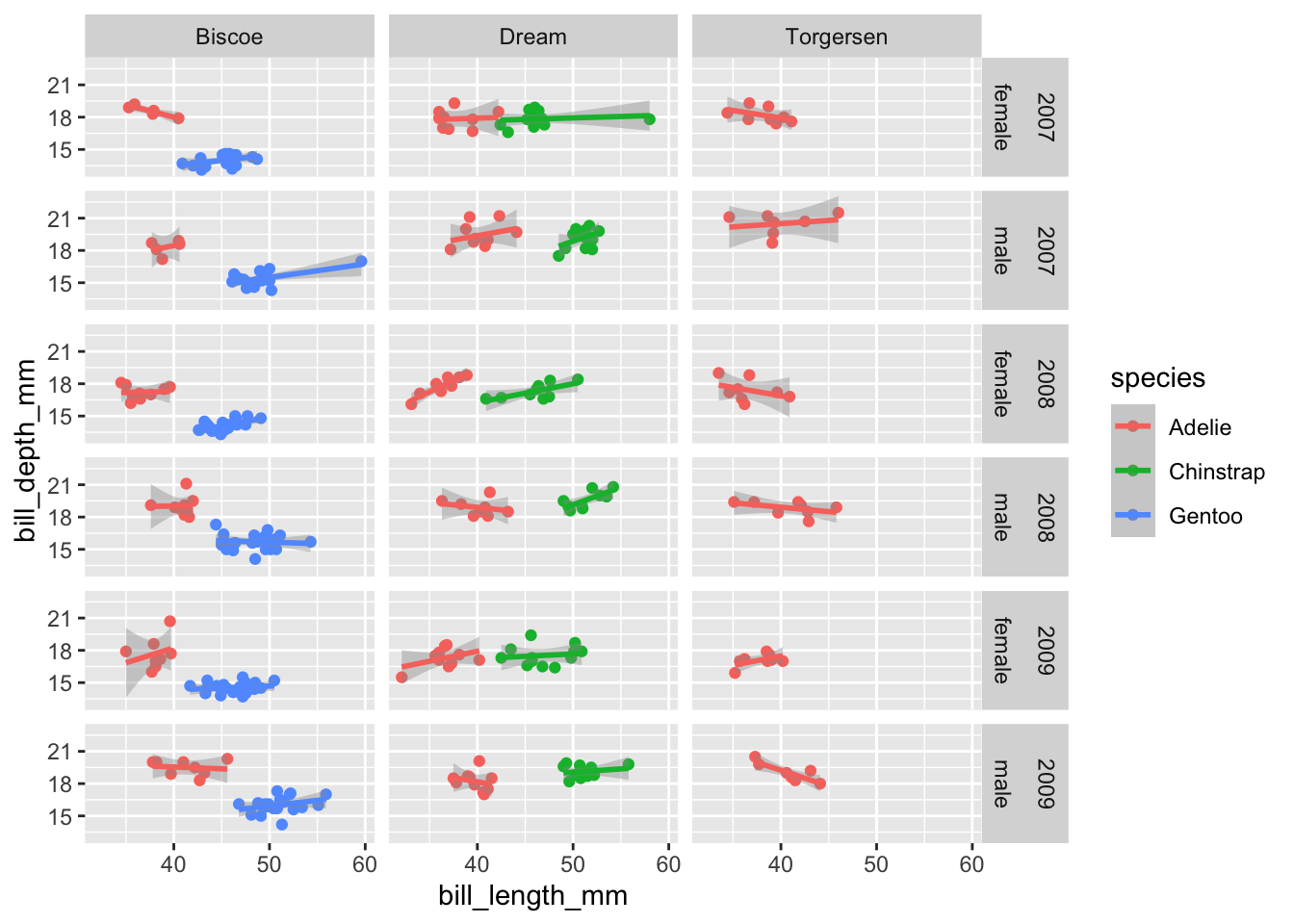
Other common graphs
Histogram
Making histograms only require a variable for the x-axis.
Let’s make a histogram of flipper_length_mm with different colors for the different species. Like before we need to initialize the plot with the ggplot() function:
ggplot(data=penguins,aes(x=flipper_length_mm,color=species))+
  geom_histogram()
## `stat_bin()` using `bins = 30`. Pick better value with `binwidth`.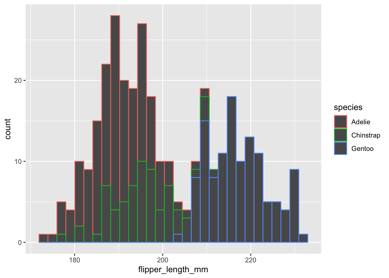
Two things we can notice: (1) the outlines of the bars are different colors but not the fill and (2) it’s giving a message about the number of bins.
For many geoms (e.g., histogram,box_plot,violin_plot)
coloraesthetic is the lines/borders butfillaesthetics is the inside color and what we generally actually want to change.By default
geom_histogrambreaks your data into 30 bins. Which may be too much or too less for your data. You can either change this by specifying the number of binsbins=xxor by the binwidth,binwidth =5.
ggplot(data=penguins,aes(x=flipper_length_mm,fill=species))+
  geom_histogram(binwidth = 5)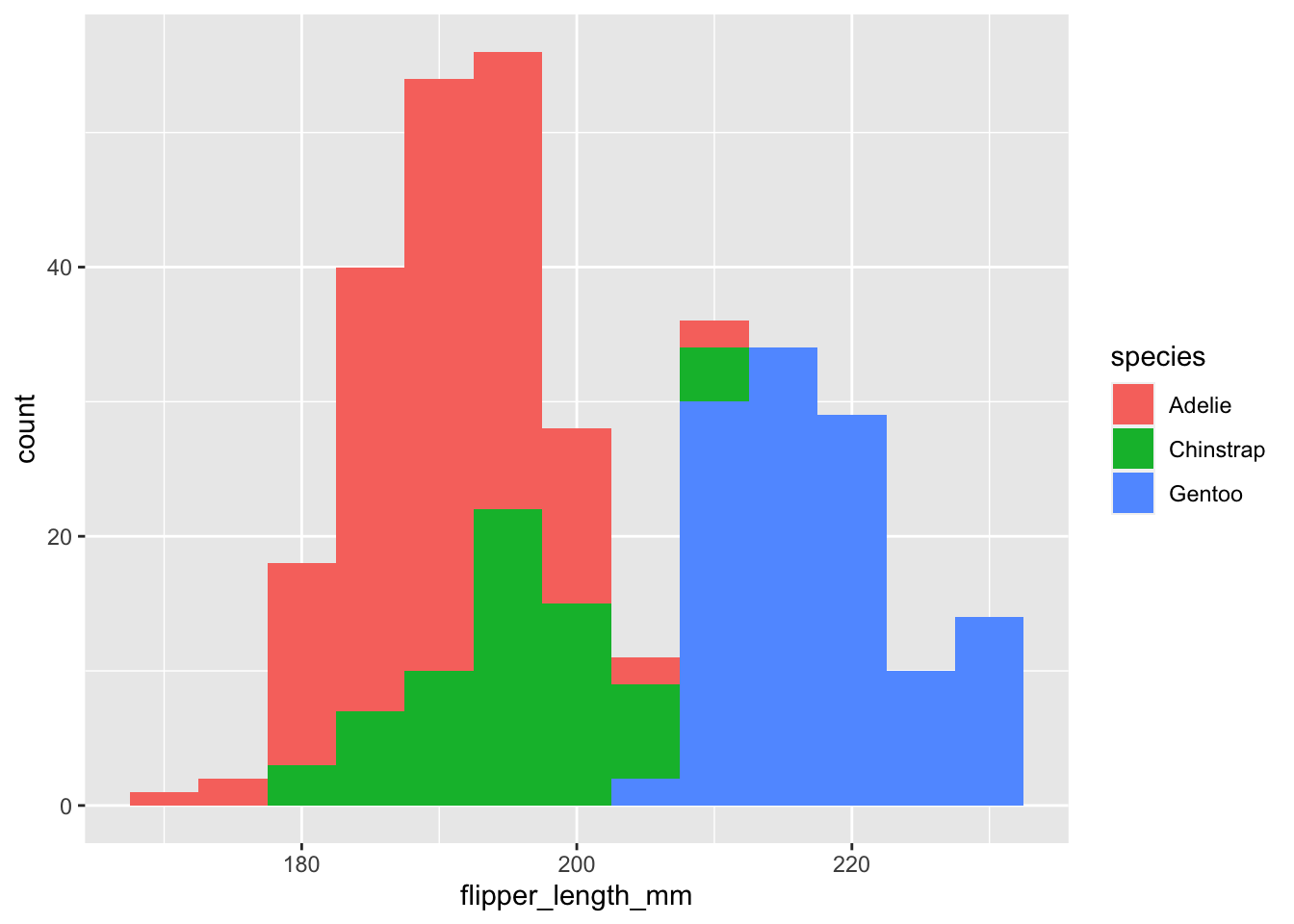
Minor tweak to histograms
On things I prefer to do for histograms is to add an outline to the different bars.
To add a border all we have to do is change the color parameter. Previously we used the color inside aes() to map color to a specific variable. We can use the same parameter outside of aes and set it to a color of our choosing. This will default to all the data. This same concept works for other aes() parameters as well (e.g., shape,alpha, fill).
ggplot(data=penguins,aes(x=flipper_length_mm,fill=species))+
  geom_histogram(binwidth = 5,color="black")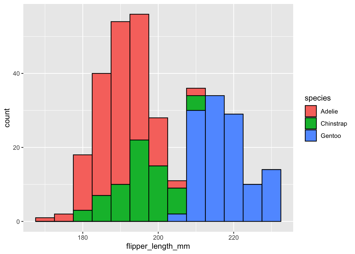
Boxplot
Making a boxplot requires a variable for both the x-axis and the y-axis.
As an example let’s make a boxplot comparing flipper_length_mm across species, but different colors for sexes. Once again, like histogram we need to use fill to change the color inside the boxplot.
ggplot(data=penguins,aes(x=species,y=flipper_length_mm,fill=sex))+
  geom_boxplot()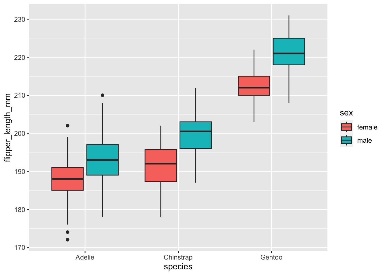
Adding in raw data with geom_point()
One criticism with boxplots is that they hide the underlying data. One way to address this is to also show the underlying data in the same graph. We can do this with geom_point(). There are a few things we need to do:
Adjust the
alphaparameter, which controls how transparent this layer is with 0 being completely transparent and 1 being not transparent.Make the
colorcorrespond to different species likefill. Since we don’t want to do this for theboxplotlayer, we will only apply this to thegeom_pointlayer. We can set this by puttingaes(color=sex)within thegeom_point()layer.We want to make the points jittered (i.e., randomly spaced out) and “dodged” (the different sexes are spaced out like the boxplot). We can accomplish this by setting
position=position_jitterdodge())
All together:
ggplot(data=penguins,aes(x=species,y=flipper_length_mm,fill=sex))+
  geom_boxplot(alpha=0.4)+
  geom_point(alpha=0.7,aes(color=sex),position=position_jitterdodge())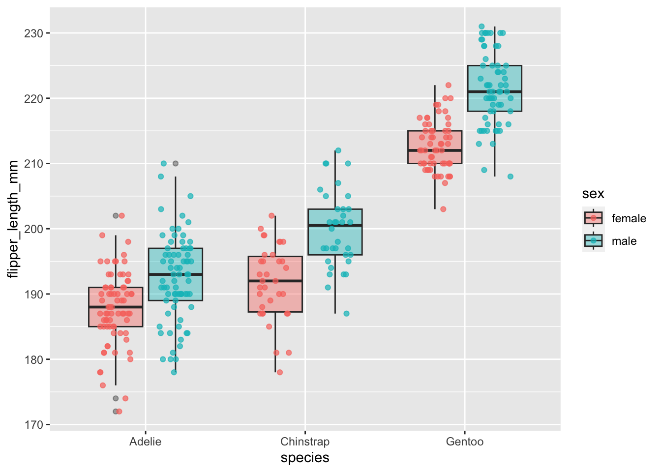
Extra handy things
Here are a just a few handy things to know when working with ggplot2.
Saving ggplots as a variable
One of the nice features of ggplot2 is you can save the plots as variables and add new layers.
For example, lets save the scatter plot as the variable plot1. Since we just saved it, the plot won’t actually appear.
plot1<-ggplot(data=penguins,aes(x=bill_length_mm,y=bill_depth_mm,color=species))+
  geom_point()+
  geom_smooth(method="lm")
But we can call it later by the variable name:
plot1
Or we can add new layers to it:
plot1 +
  facet_wrap(~island)
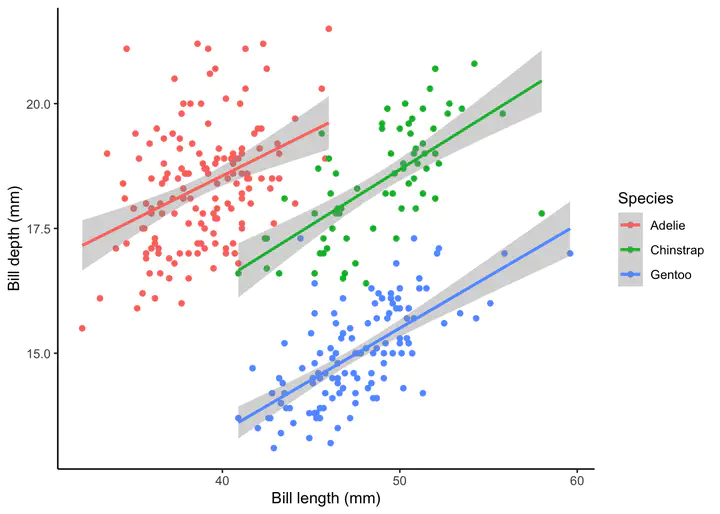
Changing labels
We can change the labels of our plot using the labs function. Where x is the label for the x-axis, y is the label for the y-axis, and color is the label for the colore legend.
plot2<-plot1 +
  labs(x="Bill length (mm)",y="Bill depth (mm)",color="Species")

plot2
Changing default theme
We can also change other attributes with theme. We won’t get into it in this tutorial, but there are so many things you can customize! Anything from the color/size of axis ticks to the family of font used on the labels. Luckily ggplot2 has some other themes, besides the default, to help get you started. Just to show a few of those:
theme_classic
plot2 + theme_classic()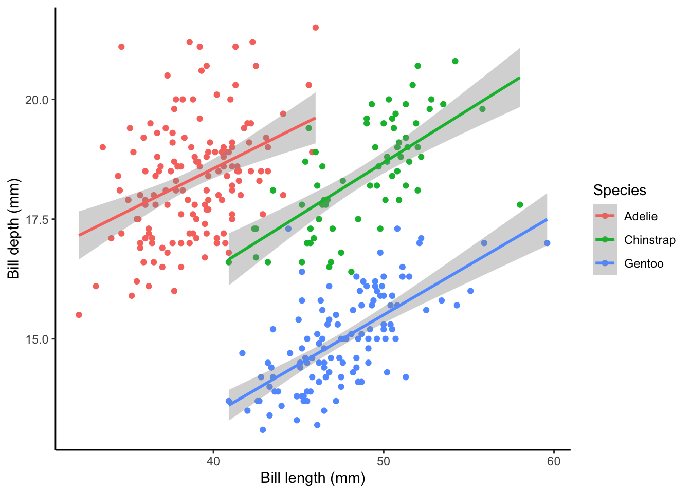
theme_dark:
plot2 + theme_dark()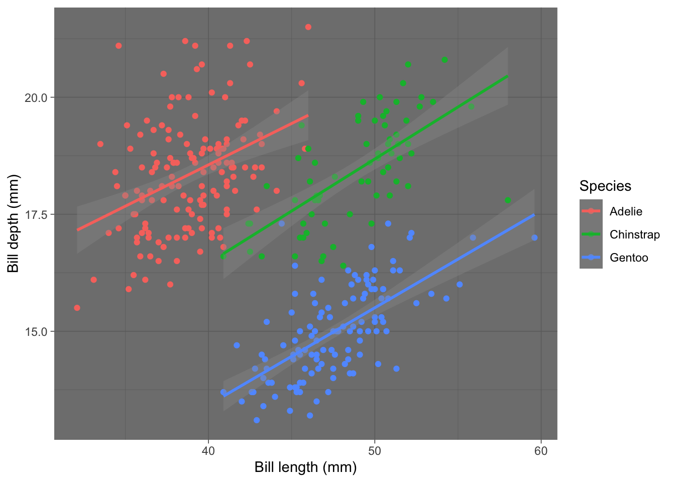
theme_void:
plot2 + theme_void()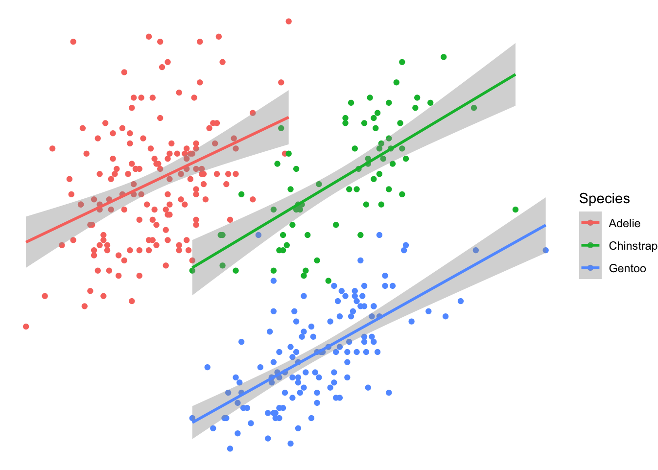
Closing remarks
I hoped you enjoyed this tutorial. Please shoot me an email if there on any tips for improvement or if you caught a bug! Other tutorials on my website go into more customizations in ggplot2 and other topics in R.
Matthew Kustra
Miller Postdoctoral Research Fellow
My research interests include sexual selection, speciation, and endosymbionts.